When you think about fonts, you may not think about sustainability and usability. But if you use printed materials, your company’s font choices can make a big difference in the amount of supplies you use. It can also make a big difference in how accessible your printed materials are.
For example, we have all probably fussed with fonts and font sizes to try to squeeze a document all into one page. Compacting the information in this way may make your document hard to read, however. On the other hand, using an unnecessarily large font size can end up creating documents that require extra pages, toner, and wear and tear on office printers.
In this article, we explain the pros and cons of choosing fonts based on accessibility and sustainability.
What are fonts?
You are likely familiar with the major font families, which are also called typefaces, such as Times New Roman and Arial. Within these font families, there are specific styles, or fonts. For instance, Arial Black is a type of font within the Arial typeface. Fonts can be further stylized with bold, italics, and underlines.
Each font has a different style and feel to it. The font you choose can make your product instantly recognizable, like the font styles used for Coca Cola, Disney, or movie franchises. It can also make your written output significantly easier or harder to read.
How does my font and font size affect sustainability?
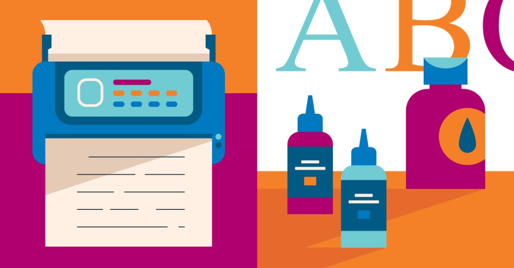
Some fonts use more ink than others. And traditional inks use petroleum, which requires fossil fuel extraction. When you choose an ink-efficient font, you cut down on the amount of ink used and save on ink costs in the process.
For instance, the font Garamond uses about 30 percent less ink than the popular font Times New Roman when used at the same font size. Century Gothic uses about 30 percent less ink than Arial. Designers are also unveiling “eco fonts” that have been designed with white spaces (such as dots or lines) within the letters, again requiring less ink.
The size of the font used also affects sustainability. Not only does a larger font size use more toner and more plastic toner cartridges, it also uses more paper. More paper means more storage space, more folders, and even more staples. While it seems small, these things add up.

Which fonts are the most accessible?
There’s a balance, though, between sustainability and accessibility. Can anyone without 20/20 vision actually read something in 8-point font?
Here are some things to consider when choosing your font and font size.
Opt for a sans-serif font.
In general, sans-serif fonts are more accessible than serif fonts. Serif fonts are fonts that have little tails, or embellishments, on the tops and bottoms of the letters. A common serif font is Times New Roman.
Sans-serif fonts are more block-like and less decorative, making them easier to read. Arial is a common sans-serif font. Generally, sans-serif fonts also use less ink.
Consider color contrast.
Good color contrast allows readers to process visual information and distinguish items from one another. It also reduces confusion and increases comprehension.
Black text on white paper has great color contrast. When you play around with styles or include images in your materials, you may be experimenting with other colors. If you are, be sure you know how to detect problematic color contrast. You can use a free contrast checker tool to make there is enough contrast for optimal readability.
Keep in mind, too, that if you’re using a colorful background, that will use more ink than a plain white background. This is an instance where accessibility and sustainability go hand-in-hand.
Think about font size.
For maximum readability, a document’s text size should generally be 14-point font whenever possible. Particularly if you are using a thin font, you will want to increase the size of the font. For businesses that work with people who would benefit from large print, use 18-point font.
In addition to size, you can also think about style. To highlight a certain portion of the text, the most accessible way to do so is with bolding rather than italics or an underline. Avoid all-caps when you can as the lack of differentiation in letter size can make it more difficult to read.
Don’t forget about spacing and alignment.
Spacing and alignment also impact the readability of a document. Consider the following tips:
- Try to opt for left justified documents. While centered justified documents can look nice, it causes uneven spacing which can be difficult to read.
- Don’t single space. Use at least 1.5 if not double spacing.
- White space is your friend! Don’t be afraid to break up your paragraphs with white space to visually signify a change in topic. Extra white space can also be useful if you expect people to take notes on the document.
Conclusion
When considering your environmental impact with fonts, it is also important to think about the readability of your final product. Nothing is a bigger waste than having to scrap your printing project entirely because it’s unreadable.
By being thoughtful about your chosen font style, you can cut down on waste and make sure a broad audience can understand and enjoy your printed products.